Wednesday 28 February 2007

Software Review: Adobe Lightroom


Up until now my post processing workflow has been relatively disorganised - I shoot everything in RAW to give me the most flexibility when back behind the computer, but how I process the NEFs has really depended on my mood. Typically I would use Adobe Bridge as my 'organiser', then tag the photos with red if I decide after looking at the preview that I would like to do some more work on the image. Once I have done a quick review of the images, I would open up each red tagged shot individually and use Adobe ACR to make fine adjustments to the exposure, and then open the shot in Photoshop to do the real hard work, using layers to play with hue, saturation, levels, curves, and sharpening until I have the end result I am happy with.

However, for 95% of the images, Photoshop has really been a bit of overkill, since I am only using the basic functionalities, and basically just an expensive memory hog.....

Enter Adobe Lightroom......

Lightroom has been designed from the ground up by Adobe as a photographer's workflow replacement, and has been labelled by many as being Adobe's response to Apple's Aperture tool, which has a very similar set of functionalities.

I downloaded an early beta copy of LR when it was first released and only available for the Mac, and quickly dismissed it - it didn't seem logical, and forced me to import all my photos to a separate library before I could work on them (which effectively doubled the storage space I needed for image storage). After playing with it for 30 minutes or so it found its way to my dustbin.

However, on Patrick's recommendation I took another look at the final release version, and was pleasantly suprised. In between the previous release I had tried, and this release, Adobe had acquired Pixmantec, the makers of RawShooter, a very flexible RAW workflow tool for the PC, and have integrated many of the features into Lightroom, making it a very flexible tool.

There are five main parts to the product: Library, Develop, Slideshow, Print, and Web. The idea behind this is first of all the user 'imports' his newly uploaded files into LR's Library (in this release however this is virtual - the images remain in their intial location, and information about the images is loaded into LR's database), then the user organises them, tags them, labels them, etc, and moves onto the next stage, Develop.

There are a number of ways an image can be developed - firstly, using the 'Quick Develop', LR will assign what it feels are the best automatic exposure settings to the image, and although this is still using Adobe Camera RAW, I have to say these settings are much more accurate than what I have experienced previously with ACR. You can either leave it at that (which I doubt I would do much), or you can fine tune the development stages, by altering contrast, saturation, hue, exposure, curves, and a number of other settings. The curve alterations has changed from Photoshop, and instead of working directly on the curve, you adjust the settings by using a number of slide bars below the graphical curve, and although this takes a bit of getting used to, in my opinion it is a lot easier to work with it like this.

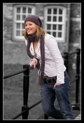
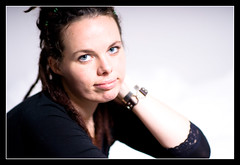
One welcome addition to the develop stage are a number of presets, including various toning options (cyanotype, sepia), b+w conversions, and something called 'direct positive'. From what I can work out, this adds around +1.15EV to the exposure, and plays around with the contrast to give a very striking image which works especially well for fashion type images. Of course one can take this preset effect and adjust it to one's own preference. See the attached photo of Heleen for an example of how this can work

Heleen

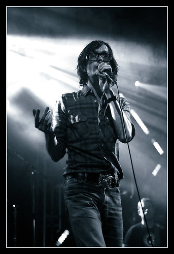
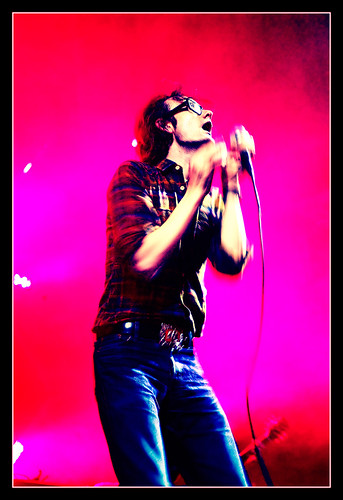
Within the Develop stage you also have the ability to do split toning, which basically gives the possibility of making toned images to your own preferences, and not just relying on the preconfigured Sepia and Cyanotype examples. Again some examples of these split tones can be seen in my Flickr photostream. Develop also supports the export of your images, and these can be automatically converted to jpg (or another format) images, assigned a colour profile, and then opened up in Photoshop or saved to disk. It is also possible to associate the export action with a Photoshop droplet, which could then, for example, add a custom frame around the edge of each image (the ability to add borders is something I feel is sadly missing from the product).

Once the developing has taken place, the next step is to display the images, and LR supports this with the Slideshow function, which allows you to show selected images as an onscreen slideshow. I really like this function, as you are not restricted to a single directory as the source for the slide show, but can instead set up a slide show based upon tags or labels, and add music (from directly within an iTunes playlist for example) and custom fade/slide progressions to the show. Ideal to show to a prospective client. The slideshow can also be exported as a pdf document, although of course the music does not get exported along with the pdf.

The Print stage allows you to set up an image for printing, and is something that I doubt I will do, since I still send away all my images to a pro lab for printing, but it seems a fairly flexible way of sending the image to a local printer.

The final stage is Web, and here Adobe has expanded the web templates from within Photoshop to give around 20 html and flash based web site designs. These can be customised to show your name, exposure details, and the colour schemes etc can be adjusted to your own personal tastes. It is definitely a very easy way to publish the images to the web, and can even upload to an ftp site automatically.

Overall, for a v1.0 Adobe has done a very good job in creating a market ready product, and I feel they have learnt from some of the weaknesses that Apple Aperture has. It uses many of the good Photographer's features from Photoshop, and expands on them to make them more friendly to the image maker. I am still discovering much of the product, but can already see that it will have a place in my workflow from now on. I will still use Photoshop from time to time, for example if I need to do cloning in an image, or play with some of the more advanced filters available, but for most of my standard stuff Lightroom will do the job.

It is available as a free 30 day trial from Adobe, and I would encourage you all to give it a go and let me know how you feel about it.....

Thursday 22 February 2007

Trip Report: Bavarian National Park (continued)


Bavarian Water Landscape
Originally uploaded by DigitalHeMan.
One of the afternoons on the trip had been set aside for a walk to one edge of the forest to have a go at some landscapes. However this plan was quickly changed as it appeared that the recent high winds in the area had led to a number of trees falling, and blocking the pathways that we needed to use. There was a note from the forester warning of the danger, and since the fallen trees were covered with quite deep snow, we decided it wasn't worth starting the hike, especially since we were not sure how far we would be able to get.

So instead we decided to concentrate on the stream and treescapes around the car park area that we had parked in. I found it a perfect opportunity to use my recently purchased Neutral Density filters to play around with some long exposure times to get the water in the stream to blur out. The first example shown here was exposed for 30 seconds using the 12-24mm wide angle (at 24mm), and the second one for 25 seconds, using the 70-180mm Micro lens at 90mm.

River stones

I felt that using the long exposure added a bit of interest to an otherwise uninteresting subject. The ND filter allowed me to extend the exposure time for long enough to get the water to blur the right amount.

Of course, both shots required the use of a tripod and a cable release ;)

Tuesday 20 February 2007

Trip Report: Bavarian National Park


Lone Wolf
Originally uploaded by DigitalHeMan.
Spent the last five days in the Bavarian National Park with FotoCampus on an expedition to photograph the animals and landscapes around there.

The park itself, covering 200 hectares, is a "Tier-Freigelaende", meaning the animals housed there (over 45 species) are able to roam freely within their allotted enclosures, and care has been taken to simulate accurate living environments for each species.

The animals are enclosed within fenced areas, mainly to provide safety to the visitors, but also to protect the animals from the natural food chain that would otherwise be in place. Some of the animals represented include red deer, otters, wild pigs, wolves, bison, owls, lynx, beavers, wild cats, and brown bears. In terms of photographic opportunities, we concentrated on the brown bears, wolves, lynx, and wild cats.

The park is very popular with photographers, as it is one of the only places in central Europe where so many types of animals are accessible by visitors, whilst at the same time being able to roam freely. This of course creates many photographic opportunities, although this sometime is accompagnied by a long wait for some action.

We were lucky with the weather, as although there had been no recent snow fall, the temperatures were still around zero, and there had also been no rain, so there was still ample snow on the ground in many parts. This of course meant we needed to use some exposure compensation to avoid the snow influencing the scene, but the benefit of digital is that this is relatively simple to calculate by using the histogram on the back of the camera.

Since the park is spread over a large area, a lot of walking is necessary to reach the animals we were interested in. The wolf in the photo accompagnying this blog was at the top of a hill around 2km from the car park - and after pulling the beach rolly loaded with all my gear up quite steep inclines to get there, I was ready for a break before we had started.....

This shot was taken with my D200 and 200-400mm F/4G VR lens attached. Since the light forced me to use relatively long shutter speeds on occassions, the need for good technique was evident. It was difficult to get the nice sharp images one would expect from such a lens, and I really needed to work on my long lens technique in order to get good results. Still, after 4 days of trying, I think I am beginning to appreciate exactly when and how to use the lens.

More in a later blog......

Wednesday 14 February 2007

Gone fishing


Self Portrait
Originally uploaded by DigitalHeMan.
Will be away for a week or so, off to the Bavarian Forest in Germany for some wildlife photography together with Claus Brandt of FotoCampus.

But I will return soon hopefully with some good shots to share with you all..... :)

Monday 12 February 2007

Magic Eraser


Sigal 13
Originally uploaded by DigitalHeMan.
Sometimes a photo needs a little extra to really stand out. In 'real life' we have the advantage of being able to see things in 3d, which gives us the immediate benefit of being able to separate a person from the hustle and bustle of the background they are standing in front of, but with the photographic medium we only see in 2d, so a confusing or busy background can often do nothing other than spoil the picture.

One way I like to separate my subject from the background is by using the magic eraser and standard eraser tools in Photoshop. With Magic Eraser I am able to click on a single point in an image and remove that patch of colour from the image that I am working on, leaving a transparent layer in it's place. I can then fine tune the area that I have deleted using the standard eraser tool.

The way I like to use this with portrait photography, such as in the examples here, is to make a duplicate layer of the image, and then turn the background layer into a black and white image. Then as I erase the top layer, I am left with the black and white image showing through underneath.

It is important to have crisp, well defined edges between the black and white layer, and the colour layer, so I will normally get as close as possible with the eraser, and then zoom in on the image, and get really close, so that the only colour left in the image is the part that I wish to highlight. Toggling the background layer between visible and invisible can help to see parts that I have missed.

This can take some practice to get right, and an image created in this way will need a lot more time than a 'normal' image, but I think the results are worth the extra effort.

Rachel and Mike

Thursday 8 February 2007

Jarvis Cocker

Some more shots from the recent Jarvis Cocker concert that I was happy with.

I liked the b+w conversion I made on the first one, and used a new method to achieve it. Instead of using a gradient map together with the channel mixer to find the appropriate levels of each of the three RGB colors in grayscale, I used a gradient map together with individual curves for R, G, and B to adjust the impact that each channel had on the shot. This also enabled me to bring Jarvis away from the background, and stand out a bit more (compare this to the unaltered shot here. Once I had done that, I used the color balance to give the picture the silver blue tone that it has.

Jarvis Cocker

The next one was achieved again by adjusting the individual channels. Red was pulled up, and green pulled down until the colors were as I liked them. I think the effect works, but would welcome your opinion as to whether you think the photoshopping is overdone.....

Jarvis Cocker


The final shot is pretty much 'as shot', with a standard S curve for improved contrast. I liked the color of the light and the sharpness in this shot.

Jarvis Cocker

More photos from this concert can be seen here

Tuesday 6 February 2007

Book Review: Michael Grecco - Lighting and the Dramatic Portrait: The Art of Celebrity and Editorial Photography

Amazon.co.uk: Lighting and the Dramatic Portrait: The Art of Celebrity Editorial Photography: Books: Michael Grecco


New York born Michael Grecco started his career as a photojournalist for the Boston Herald, and worked his way up to become the (self proclaimed) Master of Portrait Photography. He now lives and works in Beverley Hills, on call to many of the rich and famous as their resident celebrity photographer.

When you first flick through his book, you may recognise some of the shots from the entertainment press, but although this book is a portfolio of much of his work, Michael has written it with the intention of providing portrait photographers, from beginners to advanced, with a technical resource book.

The first three chapters cover the camera, illumination, and the medium. The 'camera' chapter, and the 'medium' chapter (basically covering analog vs digital, and color palettes) don't really introduce much new, although they do set the scene quite well, but the chapter covering illumination really sets this book apart from many others on the same subject.

The book is approx 30cm square format, and each double page spread in the illumination chapter is devoted to a full page photograph, together with half a page of text explaining how the photograph was made, and half a page lighting diagram. So although the average reader is unlikely to have access to the same level of model that Michael does (the page on hard lighting is accompagnied by a photograph of Kate Winslet, and the page on high speed strobes by Jet Li....) at least he will have some ideas on how to replicate the same lighting situation with his own resources. This is something that I have found sadly lacking from many other books on lighting, and something I am sure I will refer back to in future when working in the studio.

The next chapter talks about 'Creativity and Conceptualization', and this is really where Grecco sets himself apart from Average Joe. He talks about how important it is to collaborate with the rest of the team (which is fair enough), but when you realise his team includes photo assistants, set builders, photo editors, wardrobe stylists, hairdressers, make up artists, talent scouts, location scouts, publicists, artistic directors, lighting technicians, etc etc, it makes you wonder if he has someone to press the shutter button for him as well ;)

But joking aside, he does make some very helpful suggestions about how to go about designing and visualising a picture, and in the following chapter, 'The connection' talks about the best ways to build up a relationshop between the model and the photographer.

The final third of the book is filled up with case studies, in which Grecco introduces more images from his collection, and talks about the way he made each shot.

The book is just short of 200 pages, softcover, but printed on high quality glossy paper, and written in an easy to follow language.

This is a great book for anyone interested in getting some new ideas in portrait photography, and also for those who want to see a high quality collection of celebrity images, but what really made the book for me was the presentation of and the story behind the images, combined with the technical details and set ups that he had used.

Blogged with Flock

Monday 5 February 2007

Circle of Fear


Baby Seal
Originally uploaded by DigitalHeMan.
When starting out in wildlife photography there are a number of things that the photographer needs to think about. Apart from the obvious stuff, such as which camera, which lens, and which exposure settings to use, it is also very important to take into consideration the animal and the environment in which it is living.

When taking the accompanying photo, it was important to maintain the correct distance from the seal, since otherwise I would be entering the animal's 'circle of fear'. This circle is really made up of 4 rings - in the outer ring, the animal is not aware of your presence, and goes about his daily business without worrying about what you are doing.

In the next ring, the animal may be aware of your presence, but at this point he is not too bothered by what you are doing.

The third ring is where the problems begin, as the animal has now become fully aware of your proximity to him, and will prepare to flee. Obviously the environmentally conscious photographer does not want to be in this ring of the circle, as he will be upsetting the animal, causing him to depart from his natural habitat, in search of safer ground.

The final ring, or core, of the circle of fear, is the most dangerous for the photographer. This is where the animal is no longer sure that he can flee, and instead (depending on the animal) will prepare to attack in order to defend himself.

Normally a wildlife will restrict himself to the outer two rings of the circle of fear.

In order to take this photo of the seal, I was using a 500mm F/4 AFS Nikkor attached to my D200, with my Gitzo tripod as support, and I had spent the previous 15 minutes crawling across the beach on my belly in order to stay unnoticed by the seal. I was probably around 10-15 meters away at the point of exposure, and would estimate I was around the boundary of the outer ring and the second ring. I was at a safe enough distance so that the seal was barely aware of my presence, and I was safe.

Now in the case of the seals here, the risk of attack was not so great, but with more vicious animals, such as the bears I will be meeting in a couple of weeks in Bavaria, or the lions in Africa, the circle of fear may determine whether or not I return home....... ;)

Thanks to Claus Brandt of FotoCampus for teaching me the basics of the circle of fear on our trip to Helgoland :)

Sunday 4 February 2007

Subscribe to my Blog!

Due to the power of the Internet ;) it's now possible to receive all the updates to this blog in your inbox..... just click here or enter your email address in the box on the right hand column on this page.

Updates are sent out using the Feedblitz service, who promise not to spam......

You can also use this service to subscribe to any other blog you find on the Internet - just visit the Feedblitz web site and enter the address of the blog you would like to follow.....

Book Review: Skin, Lee Varis

Amazon.com: Skin: The Complete Guide to Digitally Lighting, Photographing, and Retouching Faces and Bodies: Books: Lee Varis

Book Review:

I purchased this book on a recent trip to the US after reading recommendations from fellow photographers on the Strobist Blog. The title, "Skin: The Complete Guide to Digitally Lighting, Photographing, and Retouching Faces and Bodies" should give you an idea of what goes on between the covers, and this was the reason that I had purchased the book - I wanted to know a little bit more about using the digital medium to photograph people.

However, if this was all I was expecting, I was in for a pleasant surprise - the author, Lee Varis, has been working as a Hollywood photographer for over three decades, and in this time has seen many changes in the way photographers work. He was early in embracing the new digital medium, and used his first digital camera setup already in 1990. So with this book he has aimed to share some of the knowledge gained in 15 years as a digital people photographer with his reader.

I found his writing style easy to read and understand, and the book approached the subject in a well structured manner, starting off with chapters on 'digital imaging basics' and 'color management, workflow and calibration', before moving on to more in depth topics such as 'lighting and photographing people', introducing some new techniques that I hadn't thought about before along the way.

But chapters 4 to 8 are where the real fun starts. His approach is to go through a detailed look at many of the Photoshop features that relate to people photography, together with examples and exercises (a companion CD accompagnies the book). Although the examples he uses are specifically related to people, I found that the information I learnt has helped me in general regarding my use of Photoshop - the chapter on 'Tone and Contrast: Color and B+W' is an excellent look at different ways the individual channels play a role in both color and black and white imagery (I have already put many of these techniques into play in my b+w conversions), and the section on 'The Color of Skin', which basically explains contrast, tone, and the advanced use of curves, also provides a much needed overview of this genre.

Furthermore, Lee covers in some detail image retouching, and final print preparation, including a detailed methodology behind image sharpening.

I would recommend this book to any medium to advanced Photoshop users, especially those working with portrait and fashion photography, although as I said, all of the techniques can be applied outside of the realm of 'skin' photography.


technorati tags:, ,

Blogged with Flock

Saturday 3 February 2007

Night time in Cannes


Cannes at night
Originally uploaded by DigitalHeMan.
Spent much of the previous week at Cisco Networkers in Cannes, in the South of France. Since I was working during most of the daylight hours, my photography time was restricted to the start and the end of the day. Luckily there was room in my case for my tripod, so was able to get a couple of night time shots of the center of Cannes.

I had the 12-24mm wide angle zoom on my Nikon D200, and this was shot at 22mm, ISO100, for 15s@f16. I could have shot for a shorter exposure at a wider aperture, and due to the large depth of field of the lens, I would still have had enough of the photo in focus, but I always prefer to expose slightly longer to allow relatively fast moving objects (such as cars or people) to fail to register on the sensor, giving a cleaner final image.

Obviously these sort of images would not be possible without the use of a good tripod. But with the accessibility of cheaper compact digital cameras these days, more and more people are expecting their choice of technology to deliver good results, even in the dead of night.

A couple of tips for those people ;)

1) Don't use flash! The in built flash on the average compact camera will only reach a couple of meters. In the case of the scene photographed above, that would have left me with well exposed paving slabs, and the only part of the background image that would have registered would be the bright lights on the buildings.

2) If possible, use a night mode, manual mode, or bulb mode. The aim here is to get a reasonably long exposure time and a reasonable aperture for the depth of field....

3) USE A TRIPOD! Most cameras these days have a screw thread in the base plate, allowing a tripod to be connected. This will allow the camera to be held motionless during the period of the exposure, which is important in avoiding blur. Hand holding the camera for night photography does not work - even if the image looks reasonably sharp on the camera preview screen, when it is uploaded to the computer, you will realise that it is not.

In choosing a tripod there is no need to spend a large amount of money - for a compact camera there is plenty of choice around the 30Euro mark, and this will be good enough for what you need. It is also possible to find camera supports with extendable legs that are close to pocket size.